

Apple announced iPhone Duo in September 2026, introducing an iPhone that moves between a compact outer display and a much wider folding inner display during the same browsing session. Australian pre-orders begin Friday 16 October 2026, with availability from Friday 23 October 2026, according to Apple's announcement.
1. The quick answer
A well-built responsive website should generally adapt to iPhone Duo. The device is more likely to expose existing weaknesses, such as rigid breakpoints, fixed-width sections or components that fail to react when the viewport changes, than to require a special iPhone Duo redesign.
For most businesses, the right response is not a device-specific rebuild. It is a focused round of mobile website testing across the full range between a narrow phone and a small tablet, including what happens when that range changes while the page is already open.
2. Why the iPhone Duo changes the responsive design conversation
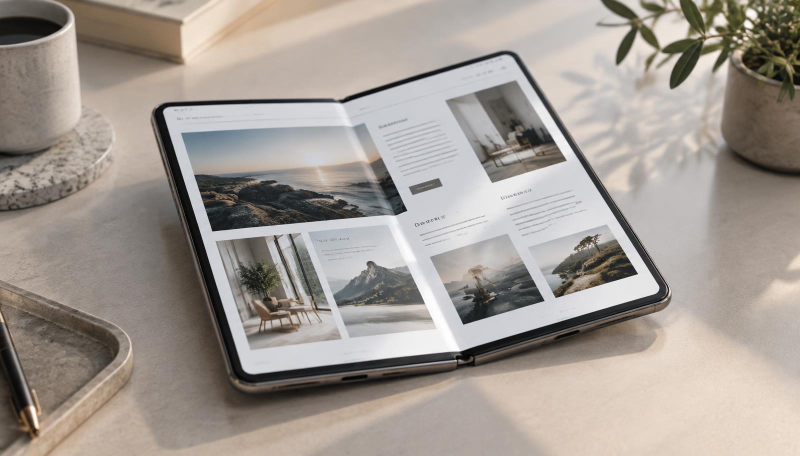
The important difference is not simply that iPhone Duo is a larger iPhone. A visitor can begin on the 5.4-inch outer screen, open the device, and continue on the 7.6-inch inner screen. Apple says both displays share the same aspect ratio so content scales proportionally between open and closed states.
That continuity is useful, but proportional scaling does not guarantee a polished website. A layout still has to decide when navigation changes shape, when columns reflow, how wide text should become, and whether overlays or sticky controls still fit. Responsive web design has always needed to handle changing space. A foldable iPhone makes that requirement more visible.
3. iPhone Duo screen size and dimensions
The figures below come from Apple's Australian technical specifications. The practical implications are ours, based on how websites respond to changing viewport space. Physical pixels and hardware dimensions do not directly equal CSS pixels, so developers should test the browser viewport rather than hard-coding these raw numbers into media queries.
| Specification | Apple's figure | Practical website implication |
|---|---|---|
| Outer display | 5.4-inch Super Retina XDR | Treat the closed device as a compact mobile experience. Navigation, forms and touch targets must remain comfortable. |
| Outer resolution | 1398 x 2034 pixels at 460 ppi | Do not target the hardware pixel count. Use the actual CSS viewport and device pixel ratio reported by the browser. |
| Inner display | 7.6-inch Super Retina XDR folding display | The open device creates room for wider content, but text lines and forms still need sensible maximum widths. |
| Inner resolution | 1878 x 2670 pixels at 430 ppi | High-density imagery should stay sharp without forcing visitors to download unnecessarily large files. |
| Open dimensions | 164.6 mm wide x 117.8 mm high x 5.2 mm deep | The wide physical format reinforces the need to test intermediate and landscape-like layouts, not only standard phone presets. |
| Closed dimensions | 84.1 mm wide x 117.8 mm high x 11.3 mm deep | Controls must remain usable in a narrow one-handed context without relying on the inner screen. |
| Display relationship | Same aspect ratio on both displays | Content can scale proportionally, but components should still reflow when the available viewport changes. |
4. Your website probably works, but that does not mean it works well
A technically responsive page can avoid horizontal scrolling and still feel unfinished. A headline might stretch across an uncomfortable line length. A two-column form might fit mathematically but become awkward to complete. A hero image might fill the space while cropping out the subject.
A polished result means hierarchy, reading width, spacing, imagery and actions all remain intentional. That is why checking only whether the page loads is not enough. The useful question is whether each part still communicates clearly and remains easy to use.
5. Where websites could struggle
- Rigid breakpoints: layouts jump from phone to tablet rules at one arbitrary width, leaving an awkward range between them.
- Fixed widths: cards, forms, tables or embeds overflow because they cannot shrink with their container.
- Navigation: a mobile menu disappears before the desktop navigation has enough room, or both states appear together.
- Hero sections: fixed-height banners create empty space, clipped copy or badly cropped imagery.
- Images and video: media uses the wrong crop, resolution or aspect ratio as the display widens.
- Forms and popups: multi-column fields, consent notices and modal actions become hard to reach.
- Chat widgets and sticky elements: floating controls cover content or compete for the same corner.
- Full viewport-height sections: browser controls and changing viewport height can cut off important content.
- One-time layout calculations: JavaScript measures the screen only on page load and never updates after the viewport changes.
6. Test the space between mobile and tablet
Device presets are convenient, but they encourage teams to check a few named screens and ignore everything between them. Open your browser's responsive mode, then drag the viewport slowly from a narrow phone width to a small tablet width. Watch every section rather than jumping straight between presets.
Look for the moment a navigation row collides, a card becomes too wide, a heading wraps badly or a form changes columns. Those moments reveal where the layout needs a content-driven breakpoint. A focused thumb-reach check can also help you review whether important actions remain comfortable to use on a phone.

7. Use fluid layouts instead of designing for a specific device
Strong responsive layouts are built around available space and content, not a list of popular devices. Flexible grids, percentage-based tracks, sensible maximum widths and media that cannot exceed its container give the design room to adapt.
Typography should respond within a controlled range, while body copy keeps a readable line length. Components should reflow when their own content becomes cramped, not because the viewport happens to match a phone model. This approach supports iPhone Duo and also protects the website against the next unfamiliar screen.
8. Review navigation and calls to action
Check the closed and open states with short and long menu labels. Confirm the menu button is easy to tap, the open menu fits without clipping, keyboard focus stays visible, and the page does not remain locked after the menu closes.
Primary calls to action should remain prominent without becoming oversized on the inner display. If a phone or enquiry button is sticky, make sure it does not cover content, cookie controls or another floating tool. A quick first-impression test can show whether people still understand the offer and next step at a glance.
9. Check hero images, videos and full-screen sections
Hero sections often carry the most rigid assumptions on a website. Test whether the heading remains readable, the subject of the image stays visible and the action does not fall below an artificial full-screen height. Prefer a minimum height plus natural content flow over forcing every hero to fill exactly one viewport.
Serve responsive image sizes and choose crops deliberately. A wide inner display may need a different crop from the outer screen, but that does not mean duplicating the whole section. CSS image positioning, the picture element and well-chosen source artwork can usually handle the change. Videos should preserve their aspect ratio and never force horizontal scrolling.
10. Test forms, popups and chatbots
Complete every important form at narrow, intermediate and wide viewport sizes. Check labels, validation messages, autofill, the on-screen keyboard and the final submit action. A form that merely fits may still be slow or confusing to use.
Open every modal, cookie notice, live chat panel and promotional popup. Confirm it stays inside the visible area, can be closed without precision tapping and does not hide the page's main action. Where possible, avoid stacking more than one overlay at a time.
11. Make sure the website responds when the phone is opened
A responsive page should respond when its viewport changes during the session, not only when it first loads. Use CSS for layout wherever possible because CSS automatically reevaluates matching rules as available space changes. Components that measure dimensions in JavaScript should observe the relevant container or resize state and cleanly recalculate.
Do not assume a particular browser behaviour that has not been documented. Test with the browsers and devices available to you, then keep the implementation based on web standards. The goal is graceful response to a changed viewport, regardless of what triggered it.
12. Safe areas, viewport units and foldable-specific APIs
CSS environment variables such as `safe-area-inset-top`, `safe-area-inset-right`, `safe-area-inset-bottom` and `safe-area-inset-left` can help keep fixed or full-bleed interface elements away from device cut-outs and curved edges. MDN's environment variables guide explains how browsers expose these read-only values through `env()`.
For height-sensitive sections, modern small, large and dynamic viewport units can be more useful than treating `100vh` as a permanently stable visible height. Use them progressively, keep natural document flow as the fallback and test with browser controls and the on-screen keyboard visible.
Developer note: the Viewport Segments API and related viewport segment media features are experimental and have limited browser availability. Check current support before using them, keep a robust single-viewport layout as the baseline, and treat segmented enhancements as progressive enhancement rather than a production dependency.
The Viewport Segments API can expose the position and dimensions of logical screen segments created by a fold or hinge. MDN's implementation guide shows the related CSS and JavaScript concepts. These tools can help highly specialised interfaces avoid placing content across a physical join, but most business websites should first solve the fundamentals with fluid CSS.
13. How to test your website before buying an iPhone Duo
- List the pages and actions that matter most, such as the homepage, service pages, contact form, booking, checkout and account sign-in.
- Open each page in responsive browser tools and resize continuously from a compact phone width to a small tablet width.
- Repeat the test in portrait and landscape-like proportions, watching for awkward transitions rather than checking only the endpoints.
- Use the Mobile Thumb Test to review action placement and the five-second website test to check message clarity.
- Test on at least one real phone and one tablet where possible. Browser simulation is useful, but physical touch, browser controls and keyboards can reveal different problems.
- Open menus, forms, popups, chat and sticky controls, then rotate or resize while they are open.
- Record the exact width and component where a problem appears, then fix the component rather than adding a device-specific patch.

14. Do you need to redesign your website for iPhone Duo?
No, not specifically. A robust responsive website should adapt without an iPhone Duo edition. If the device reveals clipped content, awkward breakpoints or controls that fail after resizing, the underlying implementation is probably too rigid.
That may call for targeted improvements rather than a complete rebuild. Review the affected components, how old the layout system is and whether similar problems appear on existing phones and tablets. If the issues are widespread, our guide to custom websites for small businesses explains what stronger foundations should include.
15. iPhone Duo website readiness checklist
Self-audit
Test these before calling the website ready
Check each item at narrow, intermediate and wide viewport sizes, then repeat after changing the viewport while the page is open.
- 1Navigation opens, closes and changes layout without collisions
- 2Hero sections keep the message, action and image subject visible
- 3Text widths remain comfortable to read on the open display
- 4Forms, validation and on-screen keyboards remain usable
- 5Popups fit within the visible area and are easy to close
- 6Chat widgets do not cover forms, calls to action or consent controls
- 7Sticky elements remain useful without obscuring content
- 8Images and video stay sharp, correctly cropped and within their containers
- 9Touch targets have comfortable size and spacing
- 10Viewport and orientation changes do not leave a stale layout
- 11Resize-dependent components update without reloading the page
16. Build for changing space, not one new phone
iPhone Duo is a useful prompt to review responsive design, but it should not become another hard-coded target. The durable approach is a website that responds to its content, its container and the space available. That improves the experience across today's phones, tablets and laptops while making the site more resilient to what comes next.
If you want a practical second opinion, Launch North can review the pages and actions that matter most, then recommend focused fixes or a stronger website foundation. Explore our website design approach, learn how SEO and website quality work together, or get in touch when you are ready.