
Launch North experiments
We Built the Website from Hell. Here's What Makes It So Annoying.
A fictional plumber, a 60 second timer and every annoying website habit we could think of, in one place.

Most people do not hate the internet. They hate the small sabotages: the cookie panel the size of a bath mat, the newsletter offer for tips nobody asked for, the booking form hiding in a menu labelled Solutions. We wanted to see what happens when a website does all of it at once, so we built the Website from Hell, a public challenge where you have 60 seconds to book a plumber on the worst website we could make.
Play the challenge
You have 60 seconds to request a callback for a leaking tap. It is free, fictional and you never enter your own details. Try the Website from Hell, then see how the same task feels on a website that respects your time.
How the challenge works
The task is deliberately ordinary: request a callback for a leaking tap tomorrow morning, using sample details supplied on a one click button. A 60 second timer starts when you choose Begin. The frustrating version puts seven obstacles between you and that booking. Afterwards, you can run the exact same task on a clean version of the same fictional business, with clear navigation, a prominent button and a short form.
Everything annoying stays inside a contained area on the page. The timer and an Exit control sit outside it, always visible. There are no pop-up windows, no sound, no flashing and no dead ends. Every obstacle can be completed with a keyboard.
The seven annoying choices
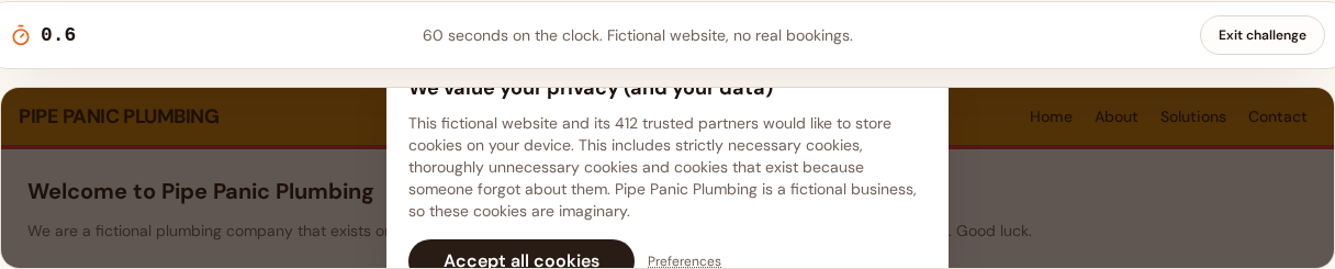
The challenge opens the way too many websites do, with a cookie panel before any content:
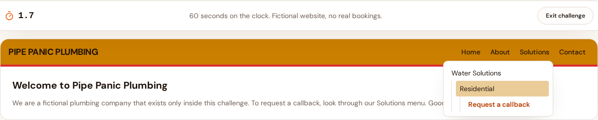
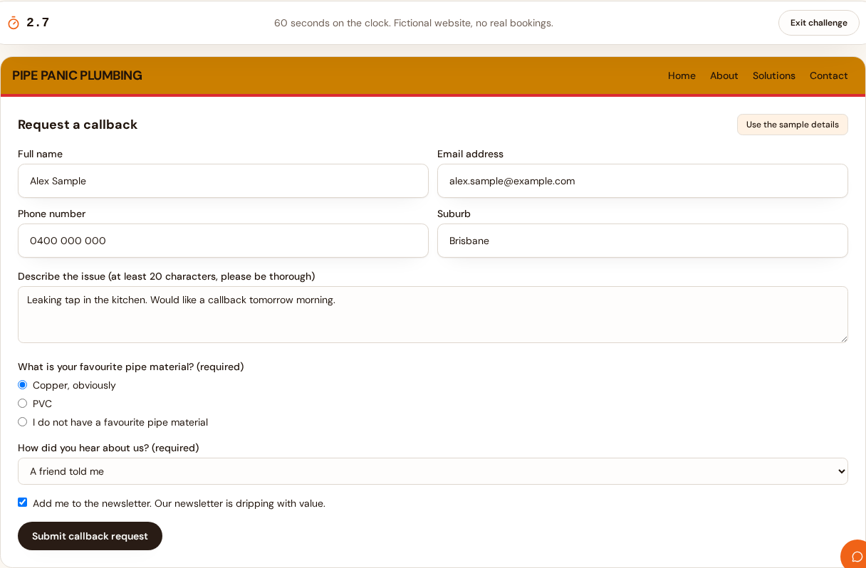
Then the booking form plays hide and seek. It lives three menu levels deep, and just when the form finally appears, the assistant parks itself on the submit area:
1. The oversized cookie panel
The first screen is a wall of text about cookies nobody has baked, with one enormous button that accepts everything and a Preferences link set in tiny dotted type. It interrupts the visitor before they have seen a single line about plumbing.
2. The newsletter pop-up nobody asked for
Our newsletter is dripping with value, apparently. The pop-up appears the moment the cookie panel closes, which is also the moment the visitor is trying to find the booking form. The close control is small and the joke is the point: newsletters interrupt tasks when they arrive uninvited.
3. The booking form hidden under Solutions
Nothing on the Pipe Panic Plumbing homepage says how to book. The callback form lives three menu levels deep, under Solutions, then Water Solutions, then Residential. Every extra click between a visitor and their goal is a chance for them to give up.
4. The chatbot on the button
Just as the form appears, an assistant called Drip parks itself over the submit area, promising a reply in roughly 45 minutes. Chat tools are useful when people actually need help. When they overlap the main action, they become an obstacle that has to be dismissed first.
5. The unnecessarily long form
Name, email, phone, suburb, an essay question, a required favourite pipe material and a nine option question about where you heard of us. Every field a visitor does not need to fill in is a reason to abandon the form, especially on a phone.
6. The surprise administration fee
After all that typing, a simulated $9.99 booking administration fee appears, with a checkbox to accept it. Surprise costs at the end of a task are one of the fastest ways to lose trust. There are no payment fields here, because the fee is fictional too.
7. The last screen of doubt
Are you really, really sure? A final confirmation that second guesses the visitor adds a pause and a wobble to a decision they had already made. Reassurance belongs before the button, not after it.
What the clean version does differently
The clean version is the same fictional plumber with the obstacles removed. The navigation says Request a callback and means it. The form has four fields. There is no newsletter interruption, no assistant parked on the button, no surprise fee and no final screen of doubt. You see the confirmation immediately.
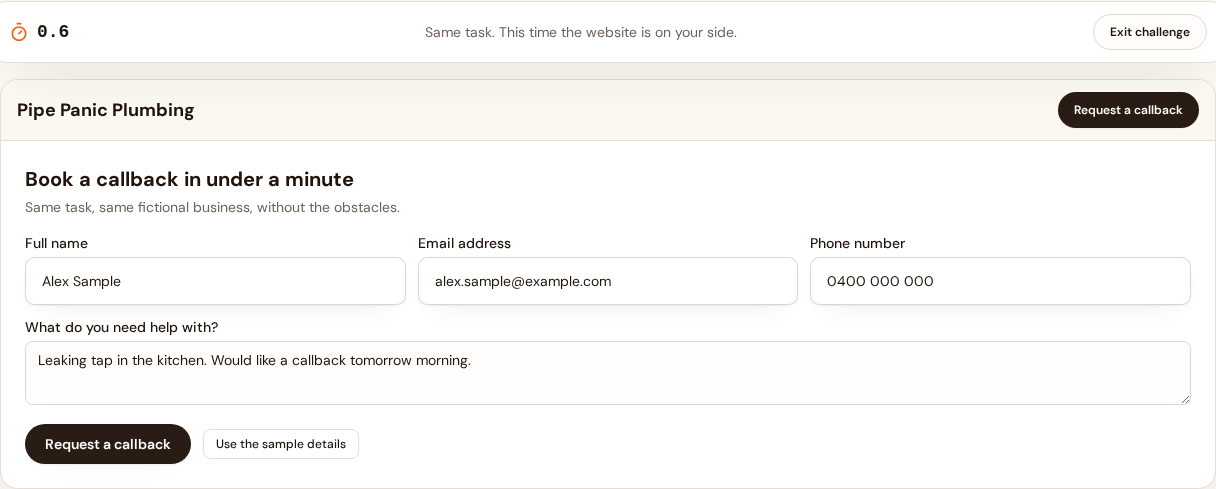
The difference is not effort or budget. It is a set of choices: clear navigation, useful information, simple forms and no interruptions between the visitor and their next step. That is the whole argument of the experiment.
What this experiment can and cannot demonstrate
The challenge can demonstrate, vividly, how familiar design habits add friction to a simple task. It cannot tell you how much friction your own website has, and it makes no claims about conversion rates, rankings or research. We do not publish aggregate results, and nothing you type is recorded or sent anywhere.
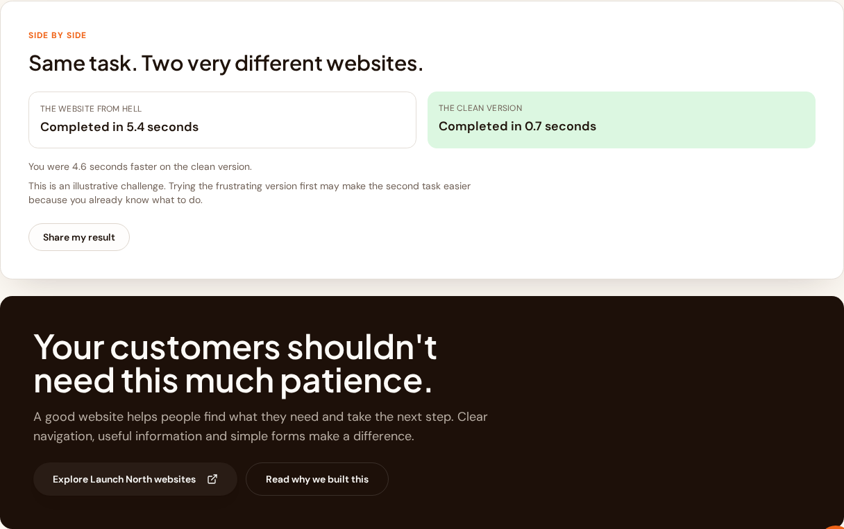
There is also an honest catch: if you play the frustrating version first, the second task feels easier because you already know what to do. We say so in the results screen rather than pretending the comparison is scientific.
A fictional demonstration
Pipe Panic Plumbing is not a real business. The sample details are fake, the fee is simulated, nothing is booked and no money moves. The Website from Hell is a fictional demonstration created by Launch North, an Australian web design and digital marketing business, to make a point about treating customers' time with respect.
For publishers
You are welcome to write about the Website from Hell. Link to the campaign at https://www.launchnorth.com.au/experiments/website-from-hell, credit Launch North and keep the fictional nature of the challenge clear in your own words. The screenshots embedded in this article may be reused with the same attribution. Please do not present the challenge as research or a study. If you have questions, contact us at hello@launchnorth.com.au.
Reviewed 5 October 2026. No participant statistics are collected or published for this campaign.
Your turn
Can you beat the Website from Hell?
Sixty seconds, one fictional plumber, seven obstacles. Then try the same task the way it should feel.